-Group project
Introduction
The Watch &Match is an application prototype that can help users use the mobile-phone environment to search, compare and select a suitable and preferred hairstyle. In this prototyping, we strive to use gesture like tilting and shaking based on accelerometer sensor and compass sensor to bring new user experience to realize comparison and decision making items.
Key Features and Insights
Using tilting gesture to realize slight adjustment
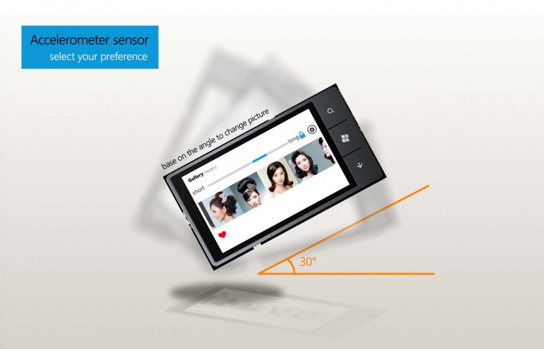
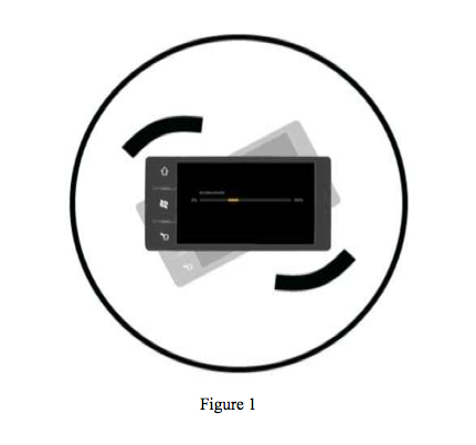
Unlike comparing products or services, there are many criteria based on the current hair situation of the user, like length or short, curly or straight, the process of selecting hair style is a carefully weighing process. In this app, we instantly provide the search results to the users based on the criteria. People could tilt the mobile phone to make the hairstyle a little bit shorter or a little longer, which fulfilled the user’s need to select and compare similar style pictures. Tilting the mobile phone device is a very naturally gesture. User could change the device orientation and angle to fine-turn the search results, instead of dragging a slider bar.
Taking advantage of the mobile-environment
User could use W&Match to upload his current hairstyle to the hair gallery and also upload his face shape to find suitable hairstyle based on the shape data uploaded before. With the location based service, W&Match is aim to connecting individual uploading data and beauty salons information to provide a service to help user select suitable hairstyles and appropriate salons.
Platform-Environment
We choose to use window phone 7 as our platform, Windows 7 Phone LG Optimus 7 as our test phone.
The hardware environment we considering is as follows,
Display: 3.8′′ Capacitive Touch screen with 800*480 Pixels Resolution.
According to the display size, we need to consider how many pictures displayed on one screen should be to and design a simple task flow to avoid the size limitation of the mobile screen.
5 Megapixel Camera, by which could upload users’ face shape and current hairstyle
Sensors: Accelerometer and Digital Compass, using accelerometer sensors to detect data changing in X axe to control the slider bar to realize the shorter or longer feature.( see figure 1)
Rationale of UI design
1. Follow the user conventional behavior
1〠At first, we need to figure out how people select a hairstyle conventionally,(see figure 2) from defining his hair quality to select a hairstyle and go to salon to compare prize and other criteria, and then to pay for the style. The whole progress actually provides a basic design requirement to our UI design. In this app, we strive to follow the conventional behavior and flow to find a desirable style efficiently.
2. Refer to the window phone 7 UI guideline and rationale
Before we develop the User Interface, we did study into the official “UI Design and Interaction Guide for Windows Phone 7â€.We need to understand the Windows Phone 7 design philosophy and principles. Here are some principles especially essential to our UI rationale.
1) Clean, light, open, and fast
It is visually distinctive, contains ample white space, reduces clutter and elevates typography as a key design element.
2) Content, not chrome
It accentuates focus on the content that the user cares most about, making the product simple and approachable for everyone.
3) Integrated hardware and software
2Hardware and software blend into each other and creates a seamless user experience from single button access to Search, Start, Back and the camera to on-board sensor integration.
4) World-class motion
The Windows Phone 7 touch and gesture experiences on capacitive screens are consistent with Windows 7 on the desktop and include hardware-accelerated animations and transitions to enhance the users’ experience at every turn.
Prototyping of UI design
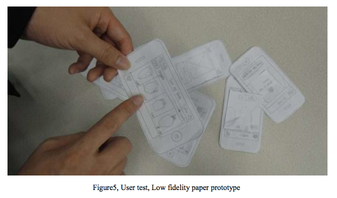
1. Low fidelity paper prototype
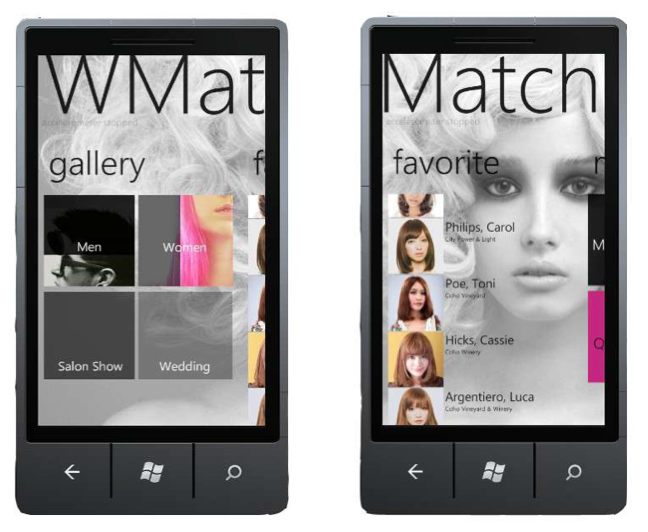
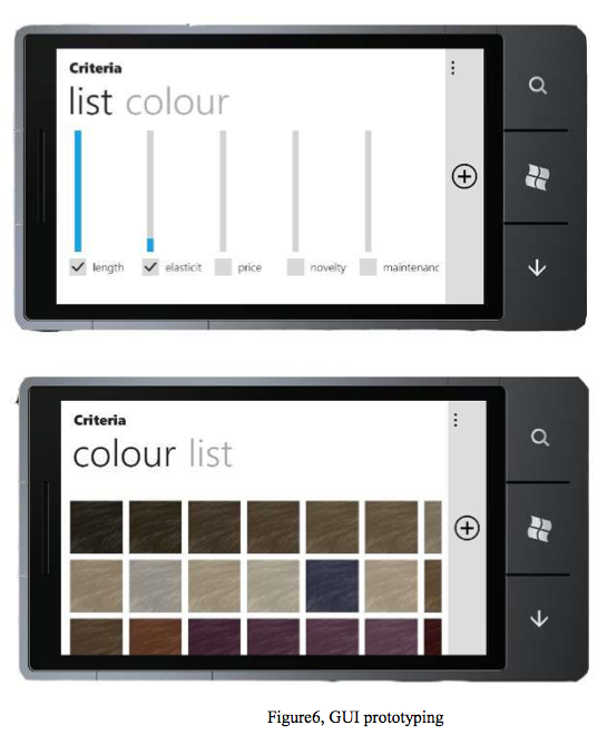
Final UI prototyping
Use Cases Diagram and Information Architecture
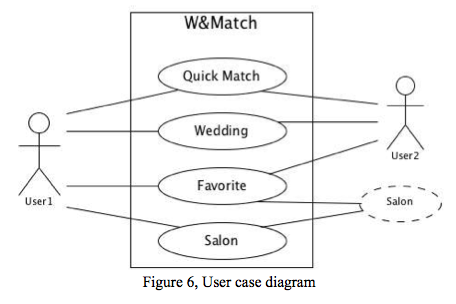
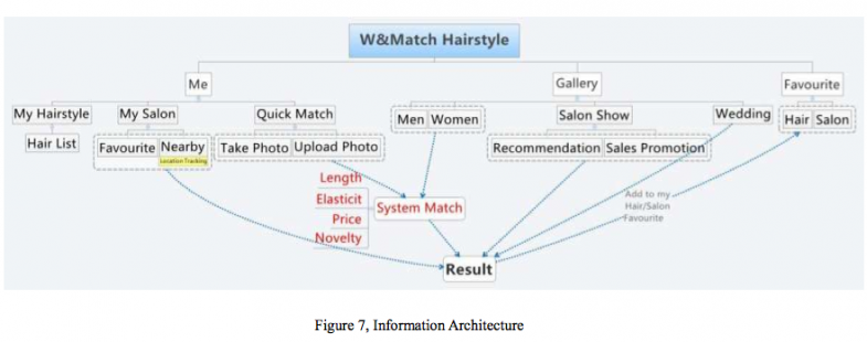
From the figure 6. We can see that the hair style was uploaded by the user themselves and salons. User could track the information about selected style by the Watch&Match, which build a connection between the user who want a new hair style and the user who already have a hairstyle, and also the salons’ service information.
Scripting of your UI design by using Expression Blend, Final
prototyping and Task Flow
Conclusion
In this prototyping application, we strive to create a novel comparison experience for users to select hairstyle in a mobile environment. We try to use the function of accelerometer sensor in some new ways to realize a slightly turn experience. Personally, this comparison interaction could be applied on many scenarios especially photos based items comparison and sorting. Beside, during the development, we get familiar to the prototyping and scripting process and apply these tools and methods to develop a real window phone 7 application.
